In my previous job, I worked in a prepress digital service bureau producing digital photographs for various commercial clients. “Retouching” was a big part of the services offered by the company I worked for and I learned a lot from my boss, who was a self-taught master of Adobe Photoshop.
When most people think about “retouching,” they often envision the radical alteration of images or the creation of totally artificial images such as the Computer Generated Imagery (CGI) that has become a big part of the movies we see. In my reality, this wasn’t the case. Retouching digital images was a routine step in preparing them for publication, and much of this work was fairly subtle in nature.
Adjusting the color of photographed objects so that the printed output matched the actual product color was a big part of what we did. Learning how to make the best use of Photoshop’s various color adjustment controls was an important part of that learning process. The modification of selected parts of images was another, such as taking a photo of a speedboat and replacing one brand of outboard motor with another.
During this time, I also absorbed a sort of “philosophy” of retouching from my boss. Some of these ideas were:
-If you notice the retouching in the final output or it has drawn attention to itself, you’ve failed. If the viewer can spot obvious retouching mistakes, you’re “busted,” but there’s a subtler standard at work, too. The finished image has to make visual sense; the various elements cannot contradict each other. Much of what I’m seeing these days has been worked over so much that it just looks fake to me, and this is just as much of a failure.
-Don’t just rely on the rote memorization of step-by-step guides from YouTube, photography magazines or websites to solve retouching problems in Photoshop. This limits your thinking. Rather, learn to understand what the various tools in Photoshop do and how they work. Then, you can think of Photoshop as a toolbox and use whatever tool works best for a particular task. Sometimes, it’s not the obvious choice, nor the one that the magazines recommend.
-Work using methods that allow you to “undo” whatever you have done. It’s very often the case that in working over an image, you end up in a situation where you didn’t quite get what you wanted (but learned a few things in the process). If you can get back to your last, best version of the work, you can proceed again with this new knowledge and produce a better result on the second try.
-Don’t try to solve all the problems in an image in one fell swoop. In my work, there is almost never one global “move” that will fix all aspects of an image. Solve the problems one-by-one, saving your changes as you go, and eventually everything will be finished.
With these guidelines in mind, I’d like to walk you through an example of how I retouched one particular image. It’s not a “how-to” guide or a Photoshop training manual, but more of a look at the problem-solving process.
Here at Saint John’s University we are celebrating the grand opening of the new Saint John’s Bible gallery in the newly-renovated Alcuin Library. I was asked to produce some photos of the facility before it opened to the public.
This state-of-the-art facility features seven large upright glass cases holding pages from the Bible. Any sort of photography in a room with 28 vertical glass surfaces is going to be challenging. In taking pictures of the display cases at HMML, I’m always having to watch out for the reflection of the camera and tripod appearing in the glass. Shots have to made at an angle to the glass; being directly in front of a glass case would mean ending up in the picture.
The glass used for the Bible gallery cases is a bit different. They are constructed with a special museum-grade glass of very low reflectivity—the effect is of near-invisibility. This allowed me far greater freedom to position the camera where I pleased rather than simply choosing points of view to avoid my own reflection.
Good as this glass is, it still shows reflections from light sources, and one such source turned out to be the thing that caused me the most trouble. It was a bright green (ugly) “EXIT” sign that, unfortunately, I couldn’t turn off for the photo session.
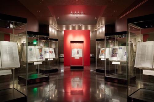
Unretouched Photo of Bible gallery space. Not too bad, but oh, that green exit sign!
In the unretouched photo you can clearly see the sign itself, but you might overlook the six reflections of the word “EXIT” that appear in various places (twice in the center display case). There is also a problem with the base of the display case directly in line with the exit sign and the polished floor section in front of it; these picked up a nasty green color cast from the sign.
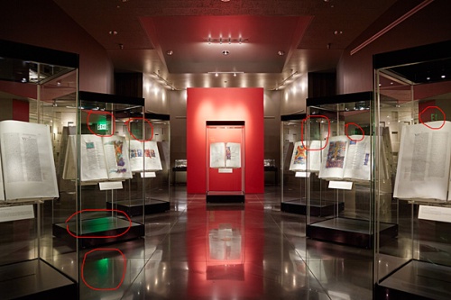
Problem areas circled in red. The green exit sign creates multiple reflections of the word “EXIT” as well as creating green color casts on the display case base and floor in front of it.
One rule I have for retouching is that the finished image has to make visual sense or else the viewer will know that something is wrong even if they can’t quite figure out what it is. This means that simply erasing the exit sign wouldn’t do—all the effects that the green sign has on the image must also be corrected.
The first step I take in retouching an image (if I know there will be substantial work) is to save it as a workfile in Photoshop’s “PSD” format. Here, for example, is the filename of the TIFF image I started with:
IMG_1484.tif
This is “saved as” with this name:
IMG_1484_WF.psd
In this way, the original file is not worked on and can be revisited in the future if it becomes necessary to completely start over with the work. The “WF” text in the filename instantly indicates to me that this is a workfile as opposed to an “output” file.
The next thing I do is select all of the content of the image (control+a) and float it to a new layer in the Photoshop file (control+j). This creates a new layer to work on with the original, untouched image below it. Now I have an instant backup of the original file within my workfile and can easily switch visibility between the layers so I can compare my work with the original. If things go astray, I can delete the layer I’m working on (by dragging it to the “trash can” icon in the layers tool palette) and start over if need be. As I work, I might select the “work layer” and float it to another new layer as I work in stages. This way, I can step back to my last good work layer if I mess something up with the next phase of work. This capability also allows me to try out techniques that I’m not really sure will work. If something fails, I can just delete the layer and go back down to the previous one.
This is merely one way of working with layers in Photoshop. If color and tonal corrections are the primary things being done, these corrections can be done in what are known as adjustment layers. These layers act like filters, imparting their effect on the image layer below without actually changing the image itself. They can be turned on or off and adjusted at will, providing great flexibility in creating variations on an image without having to create multiple images.
One of the problems with this image is that an overall color correction adjustment wasn’t going to fix everything; there are distinct areas with color problems, such as two small rectangular areas created by the reflective effects of the glass cases. These picked up an excessive green color from the exit sign. In order to work on just these areas without affecting the rest of the image a selection is created. This is a delineation of the area, made with any of a number of tools available, that isolates this area. This selection is then saved in the workfile as a separate alpha channel. In a complex workfile, there can by many such extra channels. By creating the selection, activating it, and performing some curve and saturation moves, the tone of this area was brought into line with the rest of the image.
Selected areas. These two rectangular areas of the photo picked up more green from the exit sign than others. A selection was created in these areas; working in “quick mask” mode shows the area that will be affected by any color-correction adjustments. As can be seen from the mask, only these two small areas will be affected.
Cloning out the “EXIT” reflections from the cases on the right side of the image was pretty straightforward. The double reflection in the center case was a bit tougher, as it sits in an area of tonal gradation. Anyone who uses Photoshop’s “rubber stamp” (cloning) tool knows that gradations are where cloning errors can stand out. In this case, there wasn’t a whole lot of source area to clone from that would create a seamless gradation. Even worse, the area is quite light in tone, and I’ve found that retouch errors in highlights are easier to spot than ones in shadow.
Double reflection of “EXIT” in glass case. This would be tough to remove using only the “rubber stamp” tool.
The solution is theft. The tonal gradation caused by the overhead light in this area is fairly symmetrical, so I selected a portion of the right-hand side (its mirror image), floated it to a new layer, flipped it horizontally, and morphed it over the double reflection. Now with minimal touch-up, the double reflection was gone.
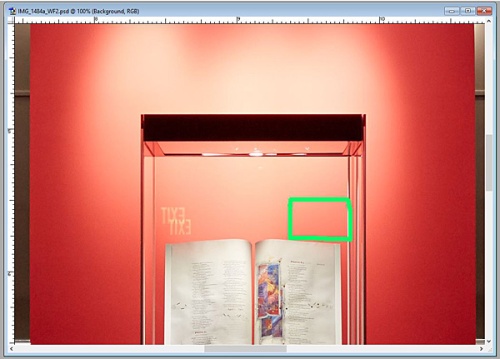
Image theft. By taking a portion of the image from the right side of the case and flipping it horizontally, it can be moved over to cover the reflections.
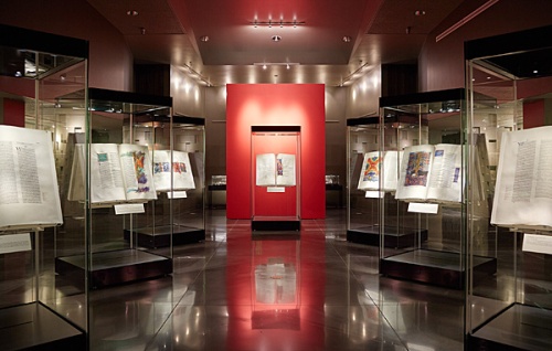
This worked well enough to make me think that the solution to the remaining green-contaminated areas could be to create a copy of the image, flip the entire thing right-to-left, and then use this uncontaminated “mirror image” material to replace the green stuff. This isn’t that hard to do, but remember that it’s easier to break up a problem into smaller parts and work on them individually.
With this in mind, I selected portions of the flipped image and created additional layers for the three problem areas: the exit sign itself, the green base of the display case, and the green area on the floor. This way I could custom-fit each replacement layer to its corresponding problem area beneath rather than trying to make the whole thing fit perfectly, which would have been a lucky feat if it had been done.
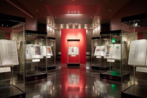
Image flipped horizontally. Now, we can use image information from the left side of this flipped image that doesn’t have the nasty green problems. We can selectively reveal these sections to correct to original.
Next, it was a matter of employing layer masking, a powerful tool that many Photoshop users tend to overlook. Here’s how it works.
Taking the green base of the display case as an example, I worked in the layer above containing the corresponding area of the flipped image. Using Photoshop’s transform tools, I nudged and stretched the “replacement base” to fit the green base. Having the layer visibility set to 50%, I could see through the replacement layer to the green layer below, allowing me to line things up. Then, I set the visibility to 100%, and the green base disappeared.
But the work is not done, as the mirror-image selection was larger than the area I needed to replace. This is where layer masking comes in. By adding a layer mask and choosing “hide all,” the corrected layer suddenly disappeared again revealing the ugly green base of the case.
Now, using the brush tool, I could “paint in” the desired area from the hidden layer above. By toggling the “x” key, one can either “open up” the layer mask, showing more of the corrected layer above or “close up” parts of it to make fine corrections. Eventually, an opening in the layer mask is created that allows just what is needed of the corrected layer above to cover up the green stuff below.
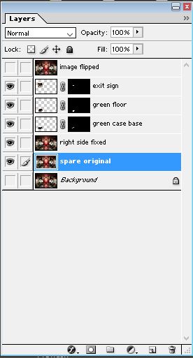
Layers palette in Photoshop. The overall flipped image was harvested to create three separate work layers that could be morphed onto the problem areas on the left side of the original image.
This was then done with the other two problem areas, eliminating the exit sign altogether and getting the garish green spot off the floor. By working on each area separately, I could solve the puzzle piece by piece.
After that, I did couple of light dodging operations on the Bible pages to make them “pop” a bit and made a few subtle tonal correction. At this point the workfile is complete.
But I never send out workfiles to printers, web developers, or the communications folks where I work. There’s too much confusing stuff in the workfile: layers, alpha channels, paths (if they were created) and adjustment layers if they were employed. At best, this array of stuff is confusing and adds unnecessary file weight. At worse, it can cause output problems when the image goes through the imposition process to create printing plates.
So an output file is created. First, make sure all the layers needed to create the corrected image are “turned on.” Then flatten the layers, getting rid of any layers that were hidden. Next, discard any alpha channels and paths that were created in the retouch process. Now you can crop the image and resize it for its intended use. Finally, apply whatever level of sharpening you want. I never sharpen workfiles unless I create an extra new image layer simply for testing. Sharpening is something that is output-size-dependent, so it needs to be done after the image is properly sized for use. This also means that different versions of the image might need different cropping, sizing and sharpening, and that’s why the workfile is so important—it’s the source of all future image derivatives.
The output file is given a name such as:
IMG_1484_OP-sRGB.tif
In this case, we can see that it’s an output file (“WF” becomes “OP”) and that it has been saved in the sRGB colorspace as a TIFF format image file. It could also have been saved in CMYK for lithographic printing purposes or in JPEG format for Powerpoint or the web. As long as you keep the workfile, you can create any version you need.
Final output image. Looks like nothing was done to it.
As it stands, the final image is a good example of something that underwent a fair bit of retouch, but doesn’t look like it, which is the whole point. It worked out fairly well, but I’m thinking of making my own temporary cover for those blasted green exit signs. It would be a lot less work.
Filed under: Uncategorized | Leave a Comment
Tags: Adobe Photoshop, CGI, HMML, photography, Photoshop, retouching, Saint John's Bible
My last couple of blogs seem to have avoided nerdy technical concepts, so I think it’s time to geek out with some tech talk. What follows is an edited excerpt from some comments I was asked to make on a “how-to” document being produced by the British Library’s Endangered Archives Project. They had produced a photographic guide for the field digitization of archival documents and wanted some feedback on its technical recommendations. One of the topics discussed in the document was the subject of Red-Green-Blue (RGB) colorspaces, specifically the differences between sRGB, which is commonly used in many digital processes, and Adobe RGB, which is often touted as the more “professional” choice for folks wanting a larger colorspace. I felt that a discussion of Adobe RGB’s advantages and potential pitfalls might be helpful. Note that in all discussions here we are talking about 8-bit-per-channel color, where intensities range from 0 (none) to 255 (all), allowing for a total of 256 levels (2 to the eighth power). Read on.
The issue of what colorspace should be used for imaging is a surefire way to start a debate among photographers and image curators. As often is the case, there is no single “right” position, but there are things to consider when making a decision on this.
Back in 1998, users of Adobe Photoshop were offered the company’s newest release of the software, version 5.0, which advertised a new feature called “color management.” Professionals who had been using Photoshop for years probably figured that they were already “managing color,” but this promised to be an entirely new technology. One thing that the user needed to do before these new features would be of use was to choose a “working RGB colorspace.”
I was working as a commercial photographer for a prepress service bureau at the time, and I can attest to the fact that most users, even experienced retouchers, didn’t really know at the time what “working colorspace” meant. We worked in “RGB,” right? And, after things were worked on, the RGB file was converted to Cyan, Magenta, Yellow and Black, (CMYK) for lithographic printing (we used a standalone $3000 piece of software just for this purpose). The files were then “scattered” to film by the imagesetter and proofed on Agfa Pressmatch material. If something needed further work, you went back, did more corrections, and ran the proofing process again.
For a color-managed workflow to function, however, the user had to choose a default RGB colorspace to work in—this would work in conjunction with the color profiles created for monitors, capture devices and output devices to create a situation where color would remain consistent throughout the capture, editing and output processes.
Photoshop offered a number of choices for a working RGB colorspace. The most familiar to us was Apple RGB which was modeled after the display characteristics of a high-end Apple Trinitron (tube type) computer monitor, which was the type of display we all used at that time. This colorspace has a white point of “D50” (5000 degrees Kelvin) and a native gamma (power response curve exponent) of 1.8, which was typical for Macintosh computers at the time. There are differing stories as to why these specs were chosen, but the most common explanation was that it best simulated what things would look like when printed.
If one wanted to use a colorspace that could encompass a slightly wider gamut (range) of realizable colors, one could choose ColorMatch RGB. This mimicked the display characteristics of the slightly pricier Radius PressView computer monitor, which was a high-end aftermarket display for Macs at that time. It too had a gamma of 1.8 and a white point of D50, but the Red, Green and Blue primaries were farther “out there” in the available visible color gamut than those of Apple RGB.
sRGB was another choice, a colorspace proposed and described by Microsoft and Hewlett Packard in 1996 and implemented in Windows 98. It had RGB primaries that were similar to Apple RGB but with a gamma of 2.2 and a slightly “cooler” white point of D65 (6500 degrees Kelvin). Being Mac snobs, we weren’t about to use anything conjured up by Microsoft for our precious color retouching needs, thank you very much!
And then there was this choice: SMPTE 240M. The acronym stands for the Society of Motion Picture and Television Engineers. It had a much larger color gamut than the previous three, a gamma of 2.2 and a white point of D65.
If you looked at a CIE color diagram, that “sail-shaped” graphic with the colors and triangles indicating various color spaces, it was obvious that SMPTE 240M was better at encompassing the total colorspace of typical high-end lithographic printing than any of the aforementioned ones. User and folks writing about Photoshop starting experimenting with the cryptically-named colorspace because of this.
Bruce Fraser, a famous author of books on Photoshop, called SMPTE 240M the “aggressive choice” when working with 8-bit-per-channel RGB workflows. Most of Photoshop’s advanced functions did not work on 16-bit images at the time, so there was a danger in working with a colorspace this large with only 256 available intensity levels for Red, Green and Blue. Since these numeric “steps” stretched out to describe such a large space, severe edits could cause posterization or banding in images, especially in the darker areas. Fraser even went so far as to propose his own custom RGB colorspace that fell between SMPTE 240M and ColorMatch RGB. He dubbed it Bruce RGB. It didn’t catch on, though it was a good idea for the 8-bit workflows we were using.
Most of us in the professional retouch field settled on ColorMatch RGB, which more closely matched our perception of what a quality Mac display should look like and had “better numbers” in terms of RGB primaries than Apple RGB or sRGB.
Adobe Systems was also looking at SMPTE 240M, and, if you believe the Wikipedia article on Adobe RGB, wanted to implement it as a standard because of its ability to encompass all the realizable colors produced by CMYK printing inks (remember that at this time, the printing industry was the primary destination of quality digital imagery, not the internet). They, according to Wikipedia, misinterpreted the “idealized” RGB primaries described by SMPTE 240M as the actual ones, and made an additional mistake transcribing the Red primary coordinates.
If this sounds ridiculous, consider that NASA lost the Mars Climate Orbiter in 1999 because one of its teams provided calculations in English units and another provided calculations in metric.
This became Adobe RGB
It’s nearly 20 years later and Adobe RGB is one of the standard choices for RGB work and is considered the one more suited to professional use, although my opinion is that this never would have happened had not the name “Adobe” been assigned to it.
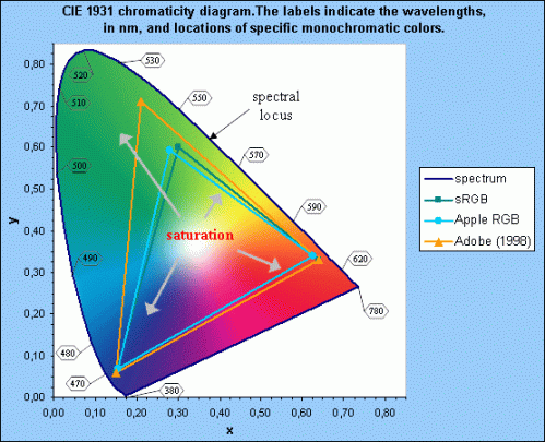
CIE Spectral Diagram with RGB Colorspaces. This is a two-dimensional representation of a three-dimensional space, but it serves to show the difference between Adobe RGB and other common colorspaces used by imaging technicians. The outer border of this sail-shaped diagram is knows as the spectral locus.
Here’s the famous “sail-shaped” diagram that we’ve all seen. The important thing to know is that the farther from the middle (the white point) the more saturated or “pure” a given color is. So, looking at this, Adobe RGB is obviously superior, right?
Technically, yes. A given color number in Adobe RGB, such as “Red 255” would be a redder red than Red 255 in sRGB. It’s also the same for the other two primary colors. In fact, sRGB Red 255 (the highest number in 8-bit color) is the same actual color in Adobe RGB as Red 219!
Different examples might involve all three colors. Maximum Green 255 (other color values at zero) in sRGB converts to the Adobe RGB triplet of:
R 144
G 255
B 60
Here, we see that “full pure green” in sRGB is the same color in Adobe RGB as its maximum green plus contamination from the other two colors. Therefore, we know that “max green” in sRGB is definitely not the purest green that Adobe RGB can represent.
In fact, Adobe RGB can represent colors far into the Cyan and Green region of the spectral locus that far exceeds what sRGB can reach. This is why Adobe RGB can encode RGB color values for pure CYAN, one of the few CMYK colors that is slightly outside the sRGB color space, which was one of Adobe’s main goals in adopting this space.
In Blue, the difference is less severe. sRGB Blue 255 (other colors at zero) translates to Blue 250 (no other colors) in Adobe RGB.
For a color management system to work, an image file needs to have an embedded International Color Consortium (ICC) color profile along with the numeric pixel color value encoding. This profile is a small bit of metadata that indicates the colorspace characteristics. A “profile-aware” system can read the numeric pixel information, refer to the embedded profile, and accurately render the true visual color that a given RGB triplet represents based on the color space specified.
Challenges of Working with Adobe RGB
Editing
When sRGB was introduced, its color primary limits were representational of the color limits of high-end monitors and eventually became the model for HDTV (in the guise of a standard called Rec 709). Therefore, Red 255, Green 0, and Blue 0 in the sRGB colorspace is the reddest red that a monitor or HDTV can display. Using the previous example, though, we see that this means that when Adobe RGB reaches Red 219, it’s at the limit for what the monitor can display for Red (it’s the equivalent of sRGB Red 255). Therefore, how would we view the Red values above 219 in an Adobe RGB image seen on a monitor?
The short answer is you don’t, not yet anyway on the vast majority of computer monitors and flat-screen TVs that exist today. There are new computer monitors being developed that claim to have the capability of displaying the entire Adobe RGB color gamut, but they’re not common and will be an expensive option for graphics professionals for some time.
You can try this in Photoshop yourself. Change your working color space to Adobe RGB and open a new RGB file (any size). Change the foreground color to:
R 255
G 0
B 0
Fill the canvas with this color; it will be an intense “candy apple” red. Now, change the foreground color to:
R 219
G 0
B 0
Create a rectangular selection in the middle of your intense red canvas and fill it with this color, which is not pure red. Now drop the selection so the “marquee box” is gone. On my (inexpensive) monitor, there’s no difference in tone and you can’t see the inner box. Adobe RGB Red 219 hits the Red limit on the monitor and Red 255 is even redder than that, but the monitor can’t show it because it’s already at the red limit.
So how do you perform color editing on a monitor in a colorspace that has colors that exceed what the monitor can show you? You go into the color settings in Photoshop and click on the “more options” button to show the “advanced controls.” There, you can find a checkbox marked “Desaturate Monitor Colors By:” with a percentage box next to it (it’s set by default to 20%). Click this, and suddenly your inner red box appears within the outer box.
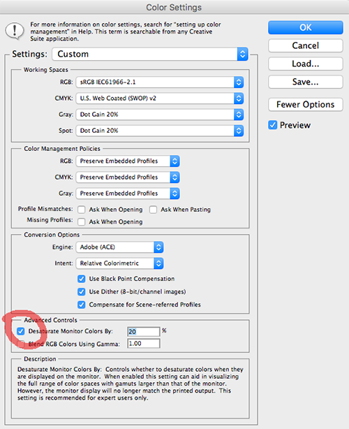
Advanced controls for color settings in Photoshop. Here, the setting to desaturate monitor colors has been turned on, allowing the user to see color relationships between saturated colors in colorspaces that exceed monitor capabilities.
The helpful hint displayed by Photoshop indicates that this setting is recommended for “experts only” and that the screen display will no longer match the printed output. However, it’s the only way to see relationships between saturated colors in Adobe RGB that a typical monitor cannot reveal. For me, this is a nerve-wracking way to work because you have to switch back to normal viewing to see what your image is really going to end up looking like overall.
Now, unclick this desaturation control (the inner box again disappears). Now, do an “assign profile” to sRGB (I use relative colorimetric rendering intent with black point compensation). Now, the outer box is still the fullest red the monitor can produce, but the center box desaturates to what Red 219 actually looks like in sRGB.
Display issues
The phenomenon illustrated by the previous exercise brings up another potential problem. If Adobe RGB images are viewed using software that is not color-managed (that is, it doesn’t recognize or respect the embedded ICC profile),
OR
for some reason, Adobe RGB images are saved without the profile embedded,
OR
if for any reason the ICC profile is removed from images that are supposed to be in Adobe RGB,
THEN
the images viewed on a monitor will appear desaturated, not possessing visual fidelity to the original object that was scanned or photographed.
This is due to all the numeric stuff described previously. If an Adobe RGB “Red 219” pixel comes into a system that doesn’t read the profile and accurately equate it with sRGB Red 255 (as it should, producing the reddest red the monitor can make), it will simply display it as Red 219, which on a monitor is a desaturated red. All the other colors follow suit.
This problem was widespread only a few years ago, when most web browsers did not read and implement embedded ICC profiles in images. Anything that was intended for Internet use had to be converted to sRGB unless one was willing to accept the desaturated look that would result from Adobe RGB images displayed without the proper color-matching to sRGB. Today, most web browsers will respect profile information embedded in image files. I’ve tested Windows Explorer, Chrome, and Firefox in Windows and Chrome, Firefox and Safari on the Mac and they all seem to work. I’ve read that the version of Apple Safari for IOS (iPhones and iPads) also works. I’ve also read that the default Android browser does not, and that various older browsers in multiple platforms may not.
So if you’re producing images for the web and you work in Adobe RGB, you don’t know for sure if the user will be seeing the images rendered properly (ICC profile respected and implemented) or slightly desaturated (profile ignored and RGB numbers simply interpreted as monitor RGB). There are no guarantees, though we can hope that users are using up-to-date browsers.


Test Images for browsers. Both square have four distinct “rings” of red intensity, with the outer ring being Red 255 and the middle being Red 220. The top square is in Adobe RGB; the bottom in sRGB. If your browser is doing color management properly, the top square should look like one solid color, unless you have a very high-quality monitor, in which case you might see a bit of the center portion.
Other image viewing applications are likewise “hit and miss” regarding the proper reading of embedded profiles in images. IrfanView, a popular PC image viewing program, does not read color profiles without installing a plugin. FastStone Image Viewer also does not unless the user deliberately enables its color management feature. Again, what images end up looking like is often out of the control of the producer of the images and at the mercy of whether the user has set the software up correctly.
Imaging technicians must at the very least make sure that if they are working in Adobe RGB, the images they create have to contain the embedded profile. If not, they are unwittingly working, in practical terms, in a desaturated sRGB colorspace and will produce inaccurate-looking results.
Digital dSlR cameras often give the user a choice between Adobe RGB and sRGB. For some time, certain Nikon dSLR models had a bug in their firmware whereby the system would not embed the proper profile in their RAW files (NEF is Nikon’s RAW file type), producing the same sort of desaturated result described above if Adobe RGB was chosen as the working space. In choosing to use Adobe RGB as a digital camera device profile, I would run some tests to make sure that the resulting RAW files contain the proper profile and that the resulting images look normal and not desaturated. This is where photographing something like a Macbeth Color Checker would be quite useful for evaluation.
If images are destined for certain types of display systems, and it is known that the system isn’t “profile aware,” the only choice for users with Adobe RGB images is to create sRGB derivatives for use with that particular system.
At HMML, we have our dSLR cameras set for sRGB. This simplifies our work considerably, as we use a “RAW+JPEG” setting in the camera where a high quality JPEG is created from the RAW on the fly as photography proceeds. This saves us the considerable time it takes to convert RAWs to JPEGs or TIFFs, and also the time it takes to create derivatives in sRGB from RAWs created in Adobe RGB. These time savings can be considerable; we recently converted the RAW NEF images for 220 manuscripts into color-corrected derivative JPEGs for the web and it took over 20 hours.
Some would claim that this isn’t the way to go and that we’re somehow lacking color in our images because of this decision. To this I would point out that having an image in the Adobe RGB colorspace does not by itself make it more “colorful.” It simply means that the colorspace parameters allow for a larger color gamut to be described by the range of RGB triplets available. In the sort of manuscript photography that we do, it is highly unlikely that any subject matter being photographed contains colors outside of the sRGB color space, so we’re not actually losing any information.
In fact, you have to look for specific types of subject matter to find colors in the real world that inhabit the area of the spectral locus covered by Adobe RGB and not covered by sRGB. Lights with pure color filtration might be one thing. Pure cyan lithographic ink on top-quality paper is another; some of the pure inks (no other colors to contaminate them) used by inkjet printers on high quality paper might be as well. But HMML’s not photographing swatches of pure inkjet ink on photo-quality paper; we’re generally photographing slightly brown paper with brownish-black ink, and an image like that rendered in Adobe RGB or sRGB will look the same; those colors will simply be described using different RGB triplets if one checks the numbers between the two versions.
In working with 8-bit color, where I have a total of 16,777,216 (256 to the third power) possible RGB triplets at my disposal, I don’t like the idea of wasting a bunch of them on color values I will never have to use based on the subject matter I’m recording. This is what my former boss from the service bureau calls, “dog whistle territory.” Lest anyone think that 16.7 million possible RGB code points is a lot, it should be noted that using the mathematics of color science and human visual perception, “seamless” RGB tonal gradations should actually require a minimum of 463 levels per color instead of 256, but most subject matter is forgiving enough to not display posterization or banding at 8 bits. If human visual perception didn’t have a gamma of around .4 (nearly the reverse of the curve described by gamma 2.2), 8-bit digital color wouldn’t be feasible at all.
But that’s a topic for another day.
Filed under: Uncategorized | 1 Comment
Tags: Adobe Photoshop, Adobe RGB, Apple, color management, Colorspace, profiles, sRGB
Years ago when I was doing advertising photography for a living, I rented a large studio in Minneapolis with another photographer. In retrospect, it seems odd to have been sharing space with a person who was essentially a competitor of mine, but this sort of thing was happening more and more as the cost of rental space increased.
One day between jobs, we were busy mopping and vacuuming the 3000-square-foot studio and tidying up the place. We were swapping stories and such, and the other guy was lamenting the fact that all this (expensive) space was dedicated to producing things that were largely ephemeral. The pictures we produced for newspaper ads, brochures and the like were all destined to become, as he termed it, “tomorrow’s garbage.”
I understood his sentiment, but pointed out that our work’s short lifespan is what ensured more work for us in the future. Still, it’s true that unless you create a famous, iconic ad photo, most of what you did disappeared from history except for what you saved for your portfolio.
Two decades later, totally out of context, I discovered that one particular photograph I created has achieved a strange sort of immortality. Here’s what happened.
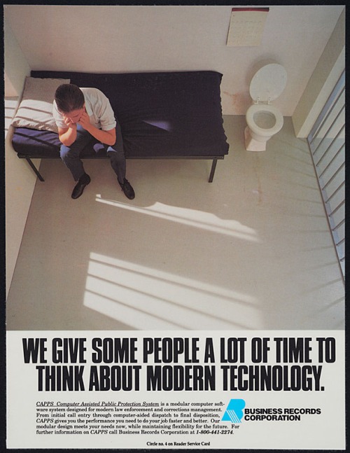
In 1989, I got the assignment to create a photo illustration for a software company. They had some sort of law-enforcement information system and needed a picture for a magazine ad. The ad’s headline was going to be, “We Give Some People A Lot of Time to Think About Modern Technology,” and was to feature a picture of a despondent criminal sitting in a jail cell, presumably captured with the help of this software.
Being that it was 1989, this wasn’t something that could be created using computer-generated imagery. It was also a time when stock photography was far more expensive than it is today, so simply buying a ready-made image wasn’t an option. To create this image, we had to build a fake jail cell in the studio.
The set for this shoot is a great example of how you can create an illusion with minimal construction. The art director’s father, an experienced carpenter, crafted a couple of box-like structures out of plywood and two-by-fours, painted to resemble a plaster wall. A simple bed was created using angle irons and a small mattress. Lengths of electrical conduit (galvanized steel tubes that electricians run wires through) mimic the look of prison bars. A toilet and calendar affixed to a wall that is actually a wide roll of paper complete the illusion.
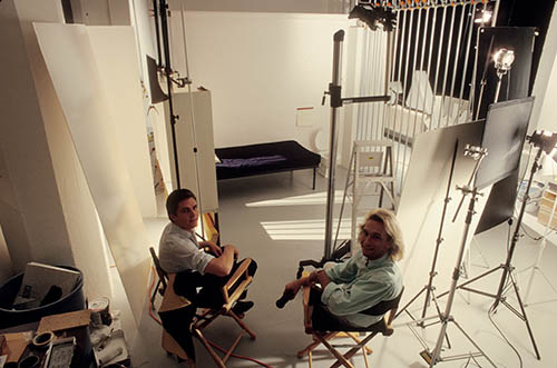
Art director and model relaxing in studio as set nears completion
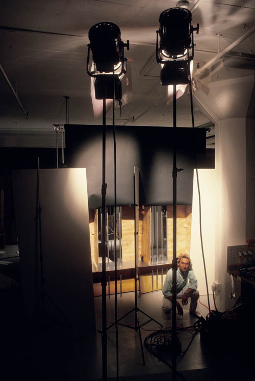
Backside of “jail cell” set showing fresnel lights used to create artificial sunlight
To create the effect of sunlight streaming through the barred windows, I rented a couple of huge Hollywood-style spotlights that throw intense beams of focused light. Fill light was created by bouncing lights into large white “flats” positioned to the side of the set. Small spotlights were used as accent lighting and another medium-sized light was positioned outside of the “cell” at ceiling height pointing at the floor; this mimicked the effect of a hall light outside the holding cell.
The resulting photo is nice example of the sort of work that made my old job quite interesting and fun at times. The advertisement turned out well and ran in some law-enforcement-oriented magazines. I moved on to the next assignment and forgot about the whole thing after a while.
Here’s where it gets weird, and you’re going to need some background information.
From 1993 to 1999, the NBC television network aired a police procedural titled Homicide: Life on the Street. This one-hour drama was based on a book by David Simon, a former crime reporter for the Baltimore Sun newspaper who served as writer and producer. Simon went on to create the acclaimed series “The Wire” for HBO.
Homicide was an excellent show with a strong ensemble cast and great writing. Still, it struggled to get ratings. TV Guide called it “the best show you’re not watching,” and the show was never as good at pulling in a huge audience as it was at gathering awards. It didn’t help that Homicide ran on Friday night, which can be a difficult time slot for any show. I had watched the show off and on during its run but had never seen all the episodes.
Fast forward to 2010 and my Netflix account. I was browsing the Netflix site for something to rent and noticed that Homicide could be ordered on DVD. A decade had passed since the series ended and there were many episodes I had missed, so I decided to watch the series from beginning to end.
One evening I was watching an episode of the show with a scene that took place in the police squad room where the detectives had their desks. In typical fashion, the room was rather messy and the walls were festooned with safety posters, photos, calendars and the like. As the camera panned across the room and fixed on one of the actors, something caught my eye.
I paused the DVD and ran it backwards a bit, then re-ran the scene. I did this a couple of times, ending up sitting on the floor inches away from the television screen. It wasn’t easy to interpret the out-of-focus piece of paper tacked to the wall of this fake police station, but I finally recognized it.
It was the “jail cell” ad I shot in 1989.
Here’s a photo of the paused DVD episode where the ad can be seen on the wall just to the left and slightly above the image of actor Clark Johnson (Yes, I still had a tube television set at the time).
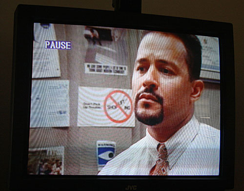
Screenshot of TV episode
I could hardly believe it. Running out to my garage, I retrieved a box filled with old portfolio samples and found the original magazine ad. It matched; the only change is that the set dresser for the TV show had trimmed the bottom of the full-page ad, removing the body copy. They probably went through dozens of police publications to find various printed items to put on the walls of the squad room set; this was just one of many.
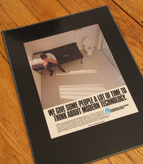
Mounted portfolio sample of the “jail cell” ad
The ad had been on that wall for at least a couple of the show’s seasons and it was fun to watch subsequent episodes and spot it on the wall from time to time. For me, it’s a bit of an inside joke—a picture of a set decorating another (far more elaborate) set.
As far as I know, this is the only photograph I ever produced that made its way to network television. And it’s also a reminder that, in some cases, work doesn’t end up as “tomorrow’s garbage,” and can take on a strange, wonderful new life of its own.
Filed under: Uncategorized | Leave a Comment
Tags: advertising photography, Television shows
